
C4D搭配动画效果
目前的C4D设计受到很多人的喜欢,因为其效果可以呈现得很有立体感、空间感。而且搭配一定的动画效果更可以突出灵动、高技术的视觉效果。本次将讲解下图C4D图动画效果制作,其主要由两大效果组成,闪光以及球体椭圆效果。本章先讲解闪光效果制作。效果可前往睿江云首页观看 http://www.eflycloud.com。
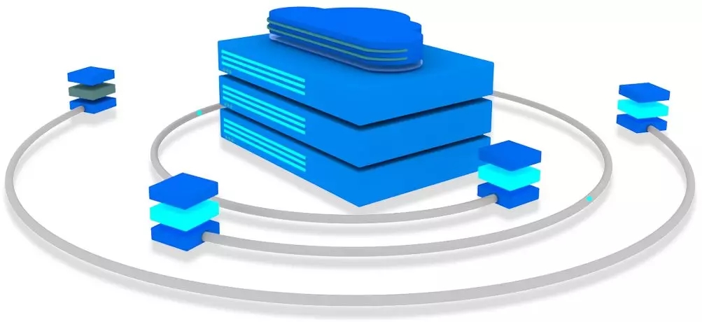
1-1 C4D动态效果图
一、底图以及闪烁图准备
(1)原始设计稿:一开始设计师给的设计图是这样子的 ↓↓↓

1-2 原始设计稿
(2)设计稿剖析:那如何才能做到闪烁效果呢?首先你要把这张图剖析:一张底图 + 闪光切割图。剖析图如下↓↓↓
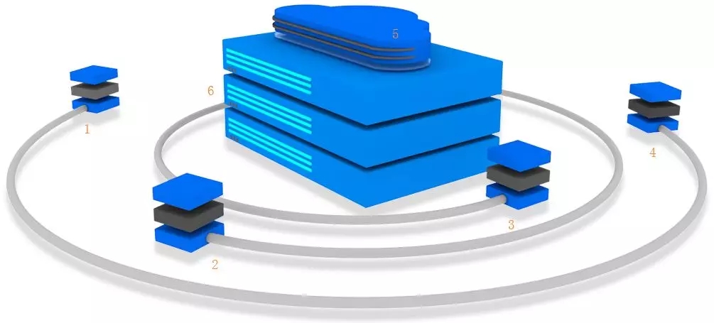
1-3底图
_20191205142606_583.jpg)
1-4 闪光切割图
以上1-3底图黑色的块则是可以进行闪光的部分,其闪光切割图是1-4图中相对应数字标签的图。可以考虑把体积小的闪光切割图合并一张图,以减少图片的请求处理。
二、css闪光效果处理
(1)底图与切割图吻合处理
先通过定位把切割图完美匹配底图,合并成一张完整的1-2原始设计图。代码实现如下:
<!-- html --><!-- 底图 --><div class="servicMainOut"> <!-- 切割图5 --> <div class="service-top1"></div> <!-- 切割图6 --> <div class="service-top2"></div> <!-- 切割图1、2、3、4 --> <div class="service-cloud1"></div> <div class="service-cloud2"></div> <div class="service-cloud3"></div> <div class="service-cloud4"></div></div>
.servicMainOut { position: relative; width: 1017px; height: 469px; background: url(https://static.eflycloud.com/V5/pc/image/home/service.png) no-repeat center;}.service-top1 { position: absolute; top: 23px; right: 416px; background: transparent url(https://static.eflycloud.com/V5/pc/image/home/cloud.png) no-repeat -396px 0; width: 224px; height: 89px;}.service-top2 { position: absolute; top: 66px; right: 563px; background: transparent url(https://static.eflycloud.com/V5/pc/image/home/cloud.png) no-repeat -620px 0; width: 135px; height: 202px;}.service-cloud1 { position: absolute; top: 100px; right: 840px; background: transparent url(https://static.eflycloud.com/V5/pc/image/home/cloud.png) no-repeat 0 0; width: 89px; height: 84px;}.service-cloud2 { position: absolute; top: 246px; right: 671px; background: transparent url(https://static.eflycloud.com/V5/pc/image/home/cloud.png) no-repeat -89px 0; width: 126px; height: 120px;}.service-cloud3 { position: absolute; top: 228px; right: 233px; background: transparent url(https://static.eflycloud.com/V5/pc/image/home/cloud.png) no-repeat -215px 0; width: 103px; height: 59px;}.service-cloud4 { position: absolute; top: 136px; right: 50px; background: transparent url(https://static.eflycloud.com/V5/pc/image/home/cloud.png) no-repeat -317px 0; width: 79px; height: 54px;}(2)闪光效果
闪光效果主要是通过控制切割图标签块透明度opacity来实现。在动画过程中,使切割图的透明图过亮或过暗,令底图与切割图叠加呈现不同的效果。opacity=1时,闪亮度最高,全然呈现切割图;opacity=0时,闪亮度最暗,无亮灯状态,全然呈现底图状态。代码如下:
@-webkit-keyframes serviceFlash {from,0%,to {opacity: 1;}40% {opacity: 0;}60%,100% {opacity: 1;}}.service-top1 {animation: serviceFlash 2s infinite;}.service-top2 {animation: serviceFlash 0.65s infinite;animation-delay: 1s;}// 切割图1、2、3、4添加service-cloud.service-cloud {animation: serviceFlash 0.3s 2;}
可以根据需要,调节动画时间、延迟执行动画时间来实现动画闪动的快慢以及动画在不同点上闪动。按照以上的方法就可以简单配置闪动效果啦。但是动画不易一下子闪动太多,否则很容易过了,给人乱糟糟的感觉。所以做单闪动或者控制多个闪动几个闪动就可以了。
官网的闪动控制下一次再总结吧,敬请期待!
睿江云官网链接:https://www.eflycloud.com/home?from=RJ0032